


Do you judge a book by its cover?
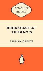
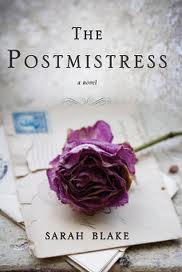
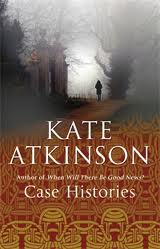
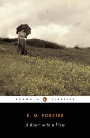
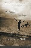
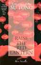
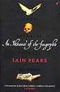
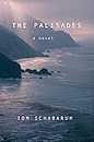
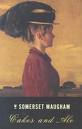
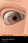
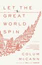
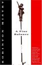
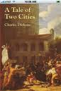
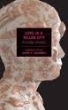
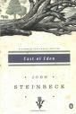
I do big time although I don’t always admit to it. Book covers are telltale sign of whether a book aligns to my interest. My perception of how a book would read is fashioned by years of experience, contemplation, and assessments of past reads. Not only do the covers matter, so does the font and size of the title. Books of which the author’s name is spelled out in much bigger font than the title itself are usually supermarket novels. (Think James Patterson.) Literary fiction and classics tend to adopt a more subdued cover in the form of a painting or tinted photographs. Loud covers to me usually associate with popular fiction, which I avoid. I don’t mind generic series cover like the Oxford University Classics. The Penguins series, with or without cover art, has always been my favorites. The cover of The Hand That First Held Mine is somewhat tricky and ambiguous. I couldn’t make of what the book is about, mainly because I’m not sure about the Marilyn Monroe-like picture zoomed to the length of the cover. Although the cover of The Great Gatsby is among the most celebrated pieces of jacket art in American literature, I was not thrilled. It’s too loud. A little-known artist named Francis Cugat was commissioned to illustrate the book while Fitzgerald was in the midst of writing it. The cover was completed before the novel, with Fitzgerald so enamored by it that he told his publisher he had “written it into” the novel. Those big eyes that look out of no face are spooky. But the big name of the book itself is more than suffice to judge it by the cover. The rule of thumb is to avoid racy covers–male and female, movie tie-in, chick-lit cover (stilettos and heavy makeup), covers of which I can’t read the title because it’s so small, beachy, knitterish, and fashion glamor covers. Experience had it that a book with no cover art or picture is worth my time.


Filed under: Meme, Personal, Reading | Tagged: Meme, Musing Mondays, Personal, Reading, Weekly Event |


I don’t tend to judge a book by the cover. I go straight for the blurb. I’m not visually stimulated, usually it’s words that get my attention. My wife is a fine art graduate and art teacher and she is all visual in terms of what makes her look at something and like it. I don’t judge things by the way they look, generally. So, no, covers don’t attract or repel me. Titles catch my eye though.
Sometimes the blurb gives away a bit too much information. I would read the blurb to a point when it reveals just too much. As per cover art, I like the ones that are adopted from arts and photography. I can do without cover arts. Sometimes a very simple and clean cover can be catchy.
Oh, I am terribly (to use the term above) “visually stimulated” when it comes to book covers. I won’t totally discount or fall in love with a book if it looks terrible in words, even if it has a fab cover but still, I’m a horribly bad sucker when it comes to pretty prints.
I also like beautiful fonts. Books with minimal cover designs also catch my attention. I like the NYRB series for the simple.